Use View Correlations to quickly view which inputs, calculations, or component‑level outputs within your current project have positive or negative correlations.
Accessing View Correlations
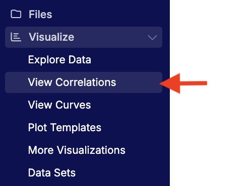
To access the View Correlations tool for your current project, select Visualize > View Correlations from the Uncountable navigation bar.
If you want to compare across projects within the same material family, switch your project scope to All Projects before opening View Correlations.
The View Correlations tool is also accessible from other points in the platform:
- From Explore Data, open View Correlations to analyze the same scope and filters you’re already using.
- When configuring a Project Spec, a View Tradeoffs button opens correlations in context.
- Within Notebooks, View Correlations charts can be embedded as items.
What You Can Compare
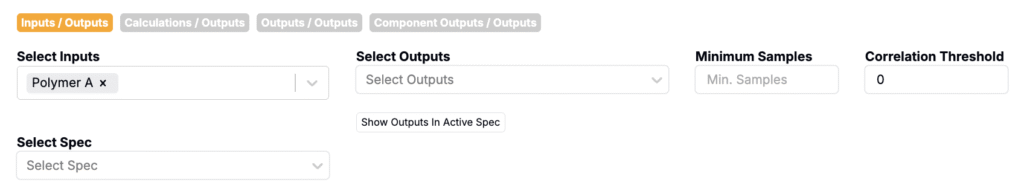
Choose one left‑hand side (LHS) dimension and one or more right‑hand side (RHS) dimensions:
- Inputs / Outputs
- Calculations / Outputs (e.g., Solids %, density, custom formulas)
- Outputs / Outputs
- Component Outputs / Outputs
Then use the dropdowns to select specific fields. Type to search, or use Show Outputs in Active Spec to bulk‑include RHS fields.
Results Views
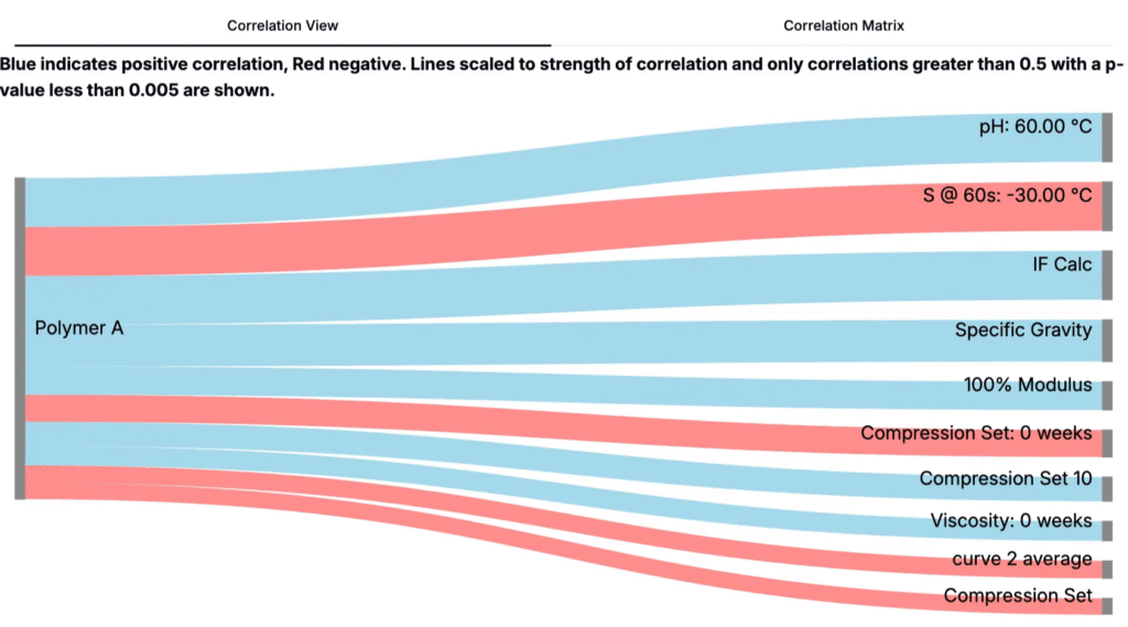
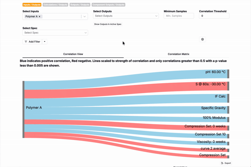
Correlation View
A Correlation View Sankey digram shows the LHS field on the left and each RHS field on the right. Band width encodes the magnitude of correlation; color encodes direction.
- Thicker bands → stronger absolute correlation
- Blue → positive correlation; Red → negative correlation
- Click any band to open Explore Data with X/Y pre-populated for that pair
In the example below, the thick blue band from Polymer A → pH @ 60 °C indicates a strong positive relationship and the thin red band from Polymer A → Compression Set indicates a weak negative relationship.
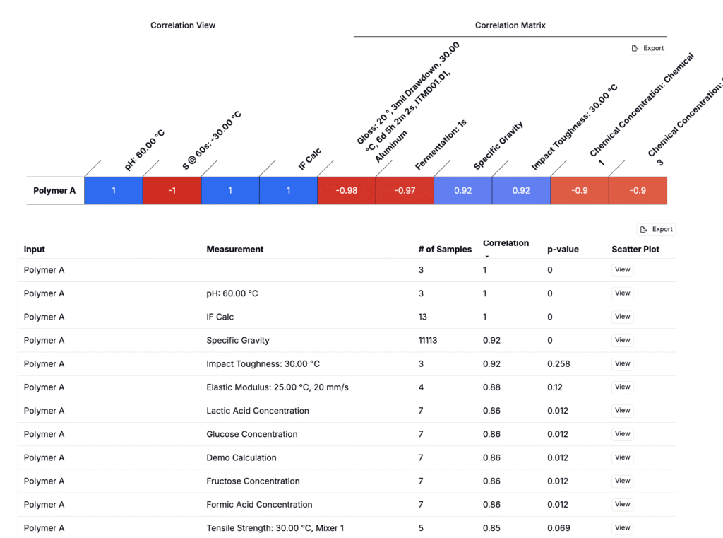
Correlation Matrix
Switch to Correlation Matrix for a tabular summary. Each cell displays the correlation coefficient (and significance if enabled). Sort or scan for the largest magnitudes.
Filters & Settings
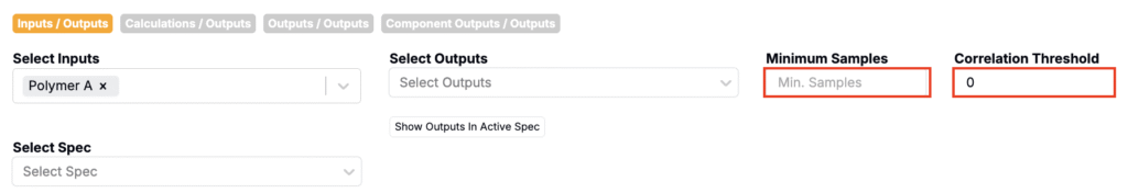
At the top of the page, users also have the option to specify:
- Minimum Samples – require at least N paired records to include a correlation.
- Correlation Threshold – only show correlations with |r| ≥ threshold.
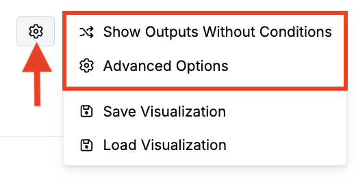
Open the ⚙️ to fine‑tune additional settings:
- Show Outputs Without Conditions – include outputs that don’t have specific test conditions set.
- Advanced Options
- Correlation Type: choose linear (Pearson), rank‑based (Spearman), or a model fit such as quadratic or logarithmic.
- Include Outliers and Tags: toggle whether extreme points and tags are considered.
View Correlation Plots
From either results view, you can open a preconfigured plot of the selected pair:
- Correlation View: Click any band to open Explore Data with axes and conditions prefilled.
- Correlation Matrix: Click View to open the same preconfigured plot.
Once on Explore Data, inspect plots, add filters or color/size axises, and save the visualization to a notebook.
Interpreting Results
- Correlation ≠ causation: treat strong correlations as hypotheses to test, not proof of influence.
- Direction & magnitude: positive (blue) means both increase together; negative (red) means one rises as the other falls. Magnitude reflects strength, not slope.
- Sample size matters: low‑N correlations can be unstable; raise Minimum Samples when screening for robust effects.
- Conditioned outputs: if an output is defined with default conditions, only data matching those conditions are included. Use Show Outputs Without Conditions or adjust the output’s default conditions if you see “no data” warnings in downstream plots.
- Permissions: you’ll only see data you’re allowed to access; restricted recipes/outputs are excluded from counts and results.
- Test samples: when outputs are measured on test samples, those measurements are included; choose the relevant condition parameters to compare like‑for‑like runs.
- Multiple comparisons: when scanning many pairs, expect some false positives. Prefer relationships that are strong, significant, and reproducible across subsets.
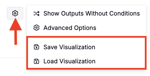
Saving & Loading
- Save configuration: store your current LHS/RHS selections, thresholds, and settings for reuse.
- Load configuration: reload a saved setup to rerun the same correlations on updated data.
Workflow Tips
- Start broad (low thresholds) to explore possibilities, then tighten criteria to focus on the most reliable signals.
- Raise Minimum Samples and the Correlation Threshold once you’ve identified candidate relationships to focus on robust, repeatable effects.
- When you find a promising pair, jump to Explore Data and save the chart to a Notebook.
Troubleshooting
I don’t see any bands in the Sankey.
- Lower the Correlation Threshold or P‑value Threshold.
- Reduce Minimum Samples to include more pairs.
- Confirm the LHS and RHS fields actually overlap in the same experiments.
An output I expect is missing.
- Click the cogwheel and enable Show Outputs Without Conditions.
- Check whether the output has strict default conditions that filter out your data.
Plots open but show “Output with specified conditions has no data…”.
- Edit the output’s default conditions or change filters in Explore Data to include available measurements.