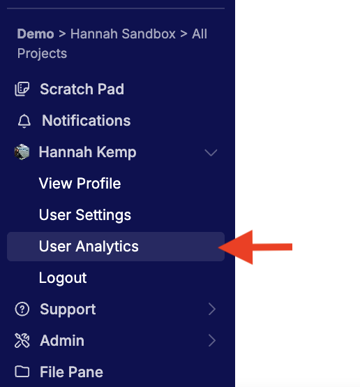
The User Analytics page allows managers and admins to review activity across the Uncountable platform. To open the User Analytics page, select [Account Name] > User Analytics from the navigation bar.
Access to this page is permission-controlled and is disabled by default for European deployments. Contact your Uncountable account manager if you need access enabled.
User Analytics
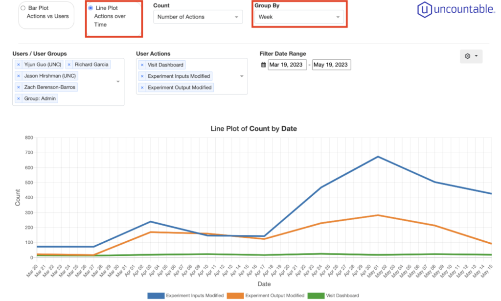
To start analyzing the usage of the Uncountable platform, you can start with selecting the users/user groups under the Users/User Groups section. This section allows you to select multiple users/user groups at a time.
Under the User Action section, you can select which actions you want to look at. There are a large variety of user actions you can look into. The common ones are: New Experiments, Experiment Inputs Modified, Experiment Outputs Modified, New Lab Requests, Visit Dashboard, Visit Enter Measurements, Visit Enter Recipe, Visit Lab Requests.
You can also use the Filter Date Range to filter to your desired date range. By default, we take the data from the recent two months.
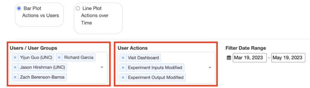
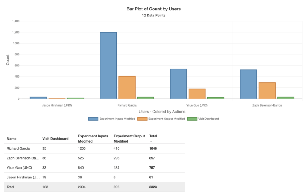
After you are done with your selection, a bar plot of count by users or user groups will show up on the page. Each color represents a different user or user group and the plot will be summarized into a data table which will show up right underneath the bar plot. Each row represents an user or user group and each column represents an action you selected above.
You can also view trend lines by clicking on the Line Plot Actions over Time option. You can group by day, week, month. Most commonly, people would love to see actions aggregate over a week.
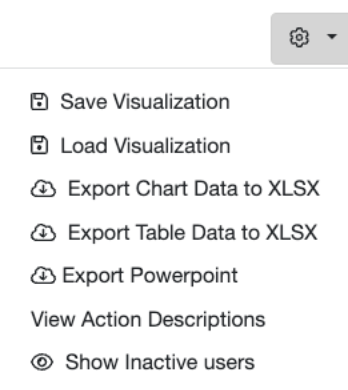
For all the visualizations you have done on this page, you can click on the gear icon (on the right side of the page) to save the visualization to a notebook, or you can export the chart or table to xlsx.