We’ve recently added support for combined charts on multi y-axis visualizations in Explore Data. This makes it possible to display multiple Y-axis series together in a single chart, with each series shown using its own chart type.
What’s changing
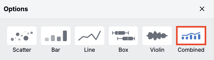
Multi y-axis charts can now be displayed as combined charts
Previously, it was not possible to create a combined charts in Explore Data.
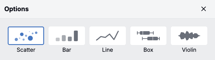
With this change, users can now select a new Combined plot type for multi y-axis charts. This allows multiple Y-axis series to be shown together in one visualization, with each series displayed as a scatter, bar, or line chart.
New Y-axis series default to scatter, and each series can be updated individually in the Y-axis configuration. To change chart types, click the chart icon next to the option and select from the menu.
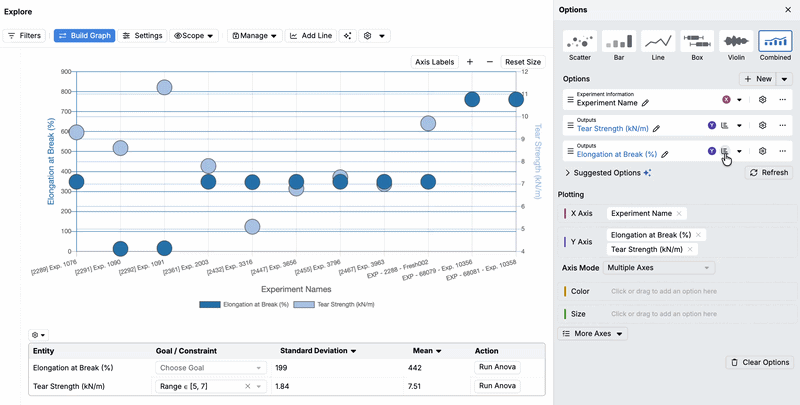
This update makes it possible to compare multiple series in a single view. It reduces the need to export data into spreadsheets or other external tools for comparison.
Potential use cases
- Compare volume vs performance — Plot time on the X-axis. Plot experiments on the Y-axis using a bar chart, and plot % passing QC (yield) on the Y-axis using a line chart.
- Show trends and variability — Plot time on the X-axis. Plot the mean response (e.g., viscosity, strength, conversion) on the Y-axis using a line chart, and plot individual replicate measurements on the Y-axis using a scatter chart.
- Track process health and deviations — Plot time on the X-axis. Plot the process metric (e.g., temperature, pH, viscosity) on the Y-axis using a line chart, and plot the count of deviations/alarms on the Y-axis using a bar chart.
Rollout
This feature is now enabled by default in all schemas.