
We’ve added a new 3D Scatter chart type to Explore Data. This makes it possible to plot three numeric axes at once, with an optional fourth dimension shown through point color, in a single chart you can rotate and zoom.
What’s changing
New 3D Scatter chart type
A new 3D option is now available on the Explore Data page alongside the existing chart types.
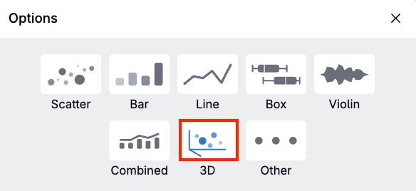
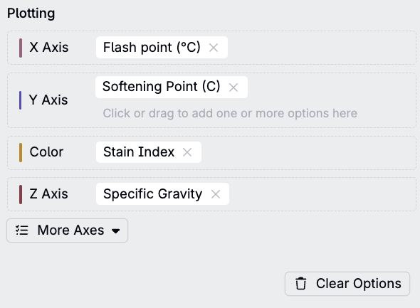
Selecting it lets you assign any plottable value to the X Axis, Y Axis, Z Axis, and Color fields.
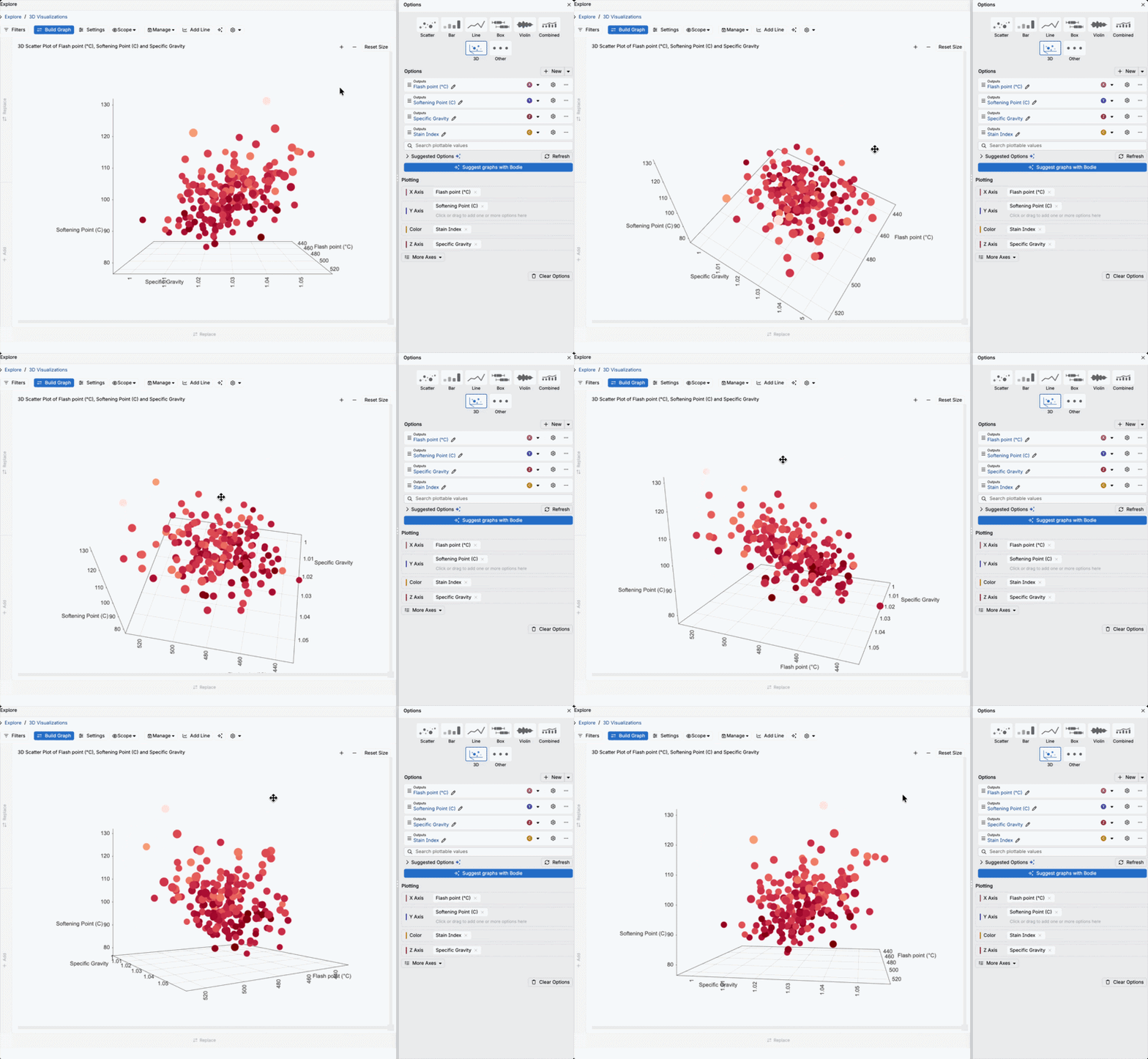
This creates a 3D visualization and users can then rotate, zoom, and hover over individual points to see their exact values.
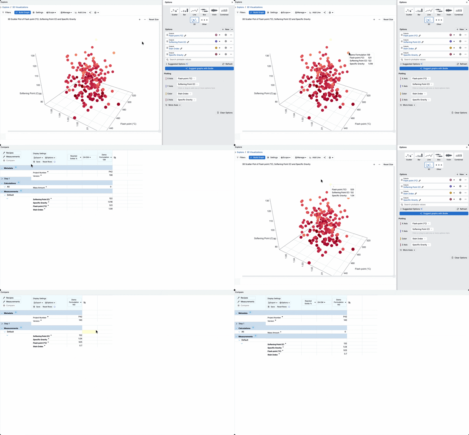
Select a data point to open a Compare view for that specific formulation.
Potential use cases
- Multi-property relationships — Plot Flash Point, Softening Point, and Specific Gravity together across a set of Raw Coating formulations, with Stain Index mapped to color, to see how thermal and physical properties move together.
- Spec compliance at a glance — Plot measured properties against a target spec to see which formulations fall inside or outside the acceptable range, and whether that lines up with a specific property combination.
- Outlier and cluster spotting — Rotating a 3D point cloud can reveal groupings or outliers that aren’t visible in a flat 2D projection.
Rollout
This is available now to all users in Explore Data — no feature flag opt-in is required. Open Build Graph, then select 3D from the chart type options to get started.