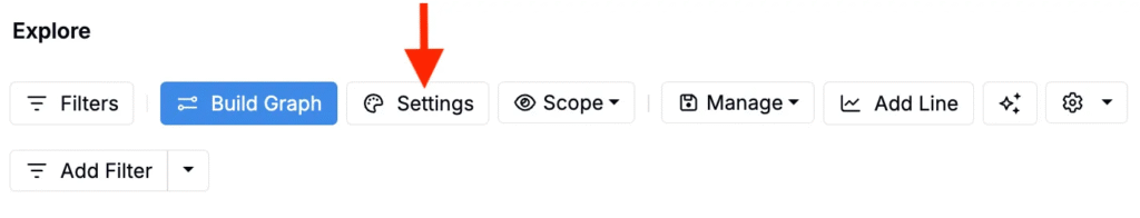
On the Explore Data page, clicking Settings opens a modal within which users can configure settings for the current visualization. Settings can be used to fine-tune axes, scales, legends, aggregation/binning, error bars, jitter/smoothing, and styling per plot.
Settings
Open the Settings button at the top of Explore Data to access additional visualization options.
Within the modal, settings are organized into relevant tabs. At the bottom of each tab you can:
- Load Settings Config — Apply a saved configuration.
- Save Settings Config — Save/share the current configuration.
- Reset All to Default — Restore all settings to default.

Main
The Main tab contains general display settings:
- Zero‑Valued Ingredients — Show/hide zeros.
- Filtered Formulations — Show/hide/highlight filtered points.
- Test Samples — Hide, separate from parent, or show only test samples.
- Lot/Experiment Visibility — Show experiments, lots, or both.
- Error Bars — Std Dev (default), Std Error, 95% CI, Full Range, or none.
- Legend Location — Above/below/left/right/hidden.
- Grid Lines — Show/hide grid.
- Custom Plot Title — Add a title.
- Number of Points Subtitle — Show/hide count (e.g., “215 Data Points”).

Axes
The Axes tab can be used to adjust axis appearance and scaling.
- Show Axis Ticks — Toggle ticks.
- Border Color/Width — Chart border styling.
- Custom X/Y Labels — Override axis labels.
- X/Y Min & Max — Set ranges.
- X/Y Step Size — Tick intervals.
- X/Y Scale — Linear or log.
- Use Global Rounding Settings — Apply global rounding to axis values.

Scatter Plot
Use the Scatter Plot tab for customizing scatter plot visualizations.
- Third Axis — Color and Size or Color only.
- Point Size / Opacity — Control appearance.
- Best Fit Line — Linear, logarithmic, quadratic, exponential, power, or none.
- Size Axis Order — Choose mapping direction.
- Color Quadrants — Show quadrant overlays.
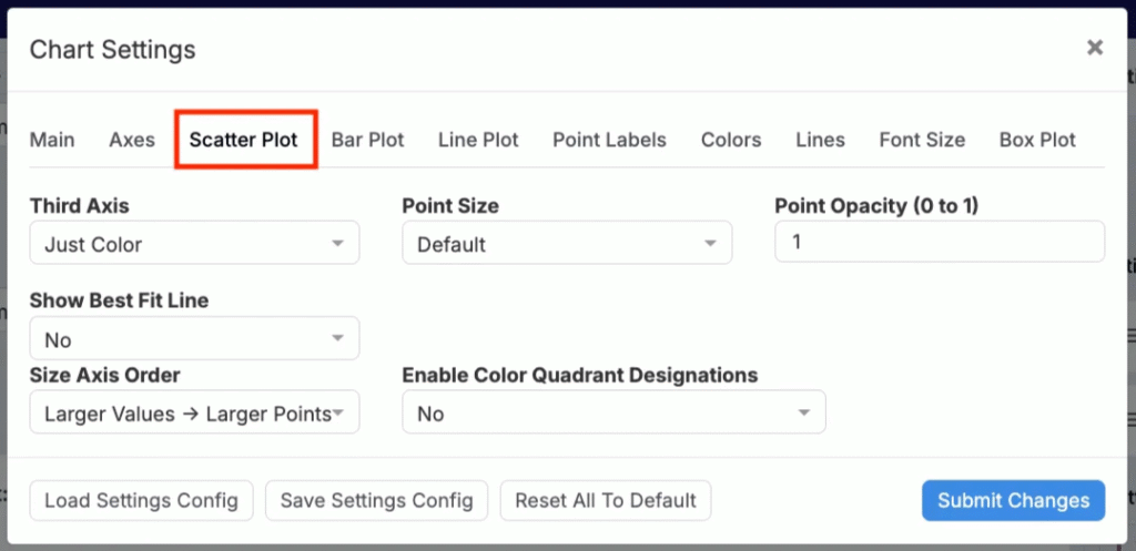
Scatter plot chart settings
Bar Plot
Use the Bar Plot tab to customize bar plot and histogram settings.
- Histogram Y‑Axis — Count or percentage.
- Bin Width — Set bin size.
- Show Number of Points — Display n per bar.

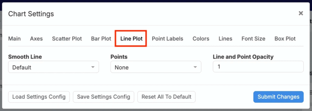
Line Plot
Use the Line Plot tab to configure line plot settings.
- Smooth Line — On (default) or off.
- Points — None / small / large.
- Line & Point Opacity — Adjust transparency.
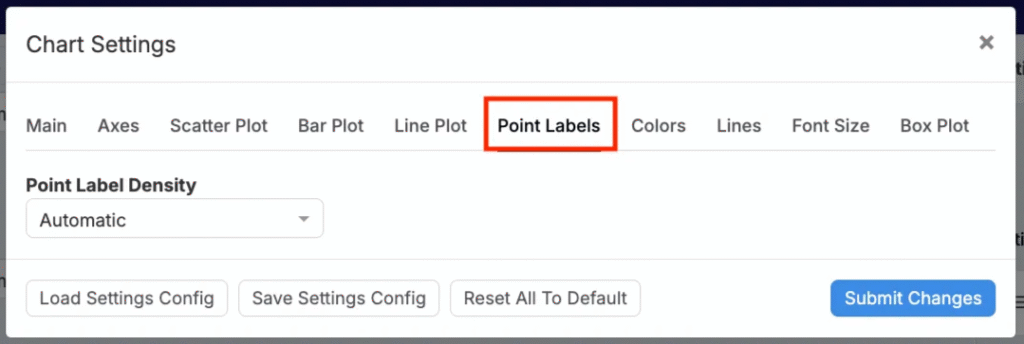
Point Labels
The Point Labels tab control density of labels.
- Automatic — Reduce label density in clusters.
- All Labels — Label every point.
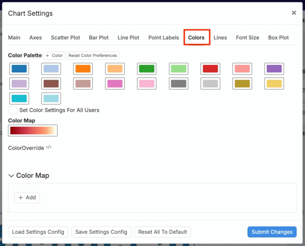
Colors
Use the Colors tab to adjust color mapping. Choose from 20 presets or upload a custom Color Map.
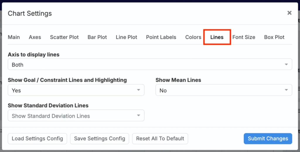
Lines
Within the Lines tab, users can manage line overlays.
- Axis for Lines — X, Y, or neither.
- Goal/Constraint Lines & Highlighting — Remove the default spec highlighting and labels.
- Mean Lines — Display mean lines.
- Std Dev Lines — Display 1, 2, or 3 standard deviation lines.
Font Size
Use the Font Size tab to set font sizes for axis labels, ticks, legend, and point labels.

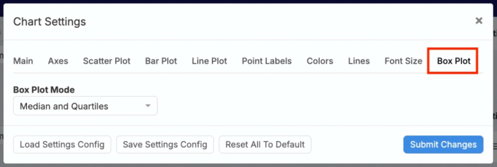
Box Plot
Use the Box Plot tab to choose a box plot display mode: Median & Quartiles or Mean & Standard Deviations.