Explore Data lets you create interactive visualizations from your experiments. Choose which fields to plot, customize the axes and encodings, then filter and highlight important data. When you’re done, save the visualization to a notebook or as a template for future use.
Creating a Plot in Explore Data
Step 1 — Access Explore Data
From the navigation bar, select Visualize > Explore Data.
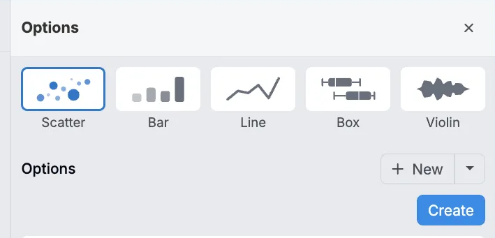
Step 2 — Choose a plot type
Pick a plot type:
- Scatter — Relationship between two variables.
- Bar — Compare quantities across categories.
- Line — Trends over time or a continuous variable.
- Box — Distribution via median, quartiles, outliers.
- Violin — Distribution plus density shape.
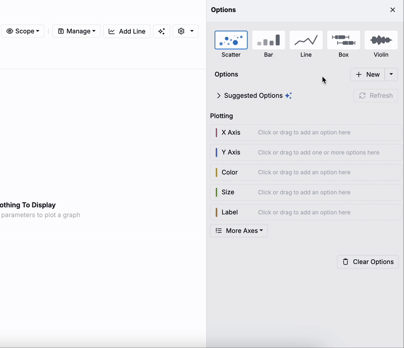
Step 3 — Add entity options
Add items you want to plot to the sidepanel by clicking New.
- First, choose an option Type:
- Experiment Information — Groups, created/edited times, notes, phase, tags, totals.
- Experiment Metadata — Additional experiment attributes.
- Inputs — Single inputs, categories, or subcategories.
- Outputs — Single outputs or condition parameters.
- Calculations — Derived data.
- Advanced Options — Annotations, custom fields, ingredient name for lots, associated step fields, base ingredients/parameters, projects, preceding steps, group fields.
- If applicable, select a Sub Type:
- Inputs
- Single Inputs — Individual ingredients/variables.
- Input Categories — Group by broad classes (e.g., solvents, binders, curatives, fillers).
- Input Subcategories — Finer groupings (e.g., monomers, epoxides, alcohols).
- Outputs
- Single Outputs — Measured properties/performance metrics.
- Condition Parameters — Conditions tied to an output (e.g., aging temperature, curing time, test duration).
- Inputs
- Use the Options field to pick the specific entity to plot.
- The system will automatically generate a name. To add a custom one, use the Name field.
- Use Settings to control how the option is plotted.
- These settings are specific to the selected type/subtype/option.
- Click Create.
Added entities appear under Options in the sidepanel. Repeat these steps to add additional options.
Entities available for plotting
Common entities are ingredients, process parameters, and measurements. Others are available as noted below.
- Ingredient — Amount used in a formulation. If working in parts, choose parts or %.
- Process Parameter — Parameter value (e.g., mixing speed in rpm). Categorical parameters often work best on Color.
- Measurement — Output value. When outputs have conditions, select the exact condition set (e.g., tensile test at 23 °C vs 100 °C). If you don’t specify, results are averaged across the condition set and variance appears as an error bar.
- Outputs with default output conditions apply those conditions automatically in visualizations and filters. See Plotting Outputs with Default Conditions for details.
- Experiment Name — Often used on the X‑axis for bar charts to compare results.
- Output Conditions — Plot a specific output condition or metadata (e.g., aging time, test temperature) to understand trends across test conditions.
- Custom Value — Extras such as standard deviation, most common ingredients, individual replicate values (contact your Account Manager for enablement).
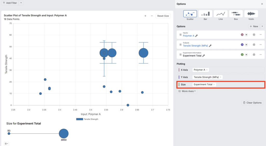
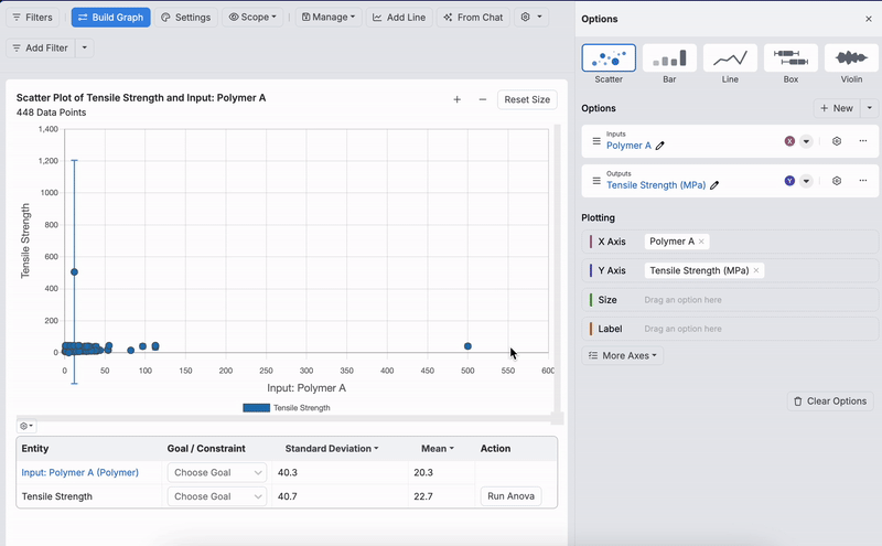
Step 4 — Assign options to axes
Under Plotting, drag an option onto an axis, or use an option’s menu to assign it.

Click More Axes to access additional axis types, beyond X and Y.
- Color — Assign colors by category/value (e.g., Color by Creator to color points by experiment owner).
- Size — Scale point size by a numeric value (e.g., Experiment Total).
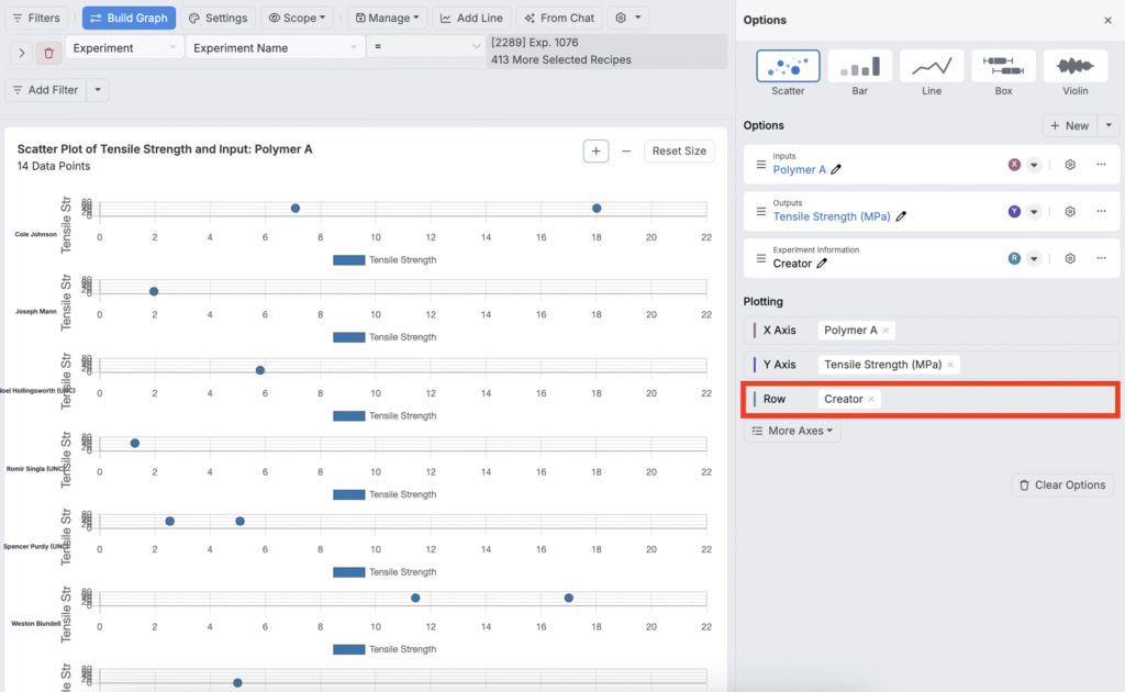
- Row — Create a separate row for each unique value.
- Column — Create a separate column for each unique value.
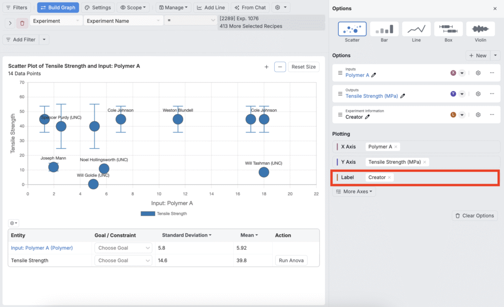
- Label — Display text labels on each point (e.g., show Creator names on points).


Customizing a Plot
After assigning axes, refine your view with filters, settings, scope, and trend lines.
Filtering
You can filter data directly from the Explore Data toolbar:
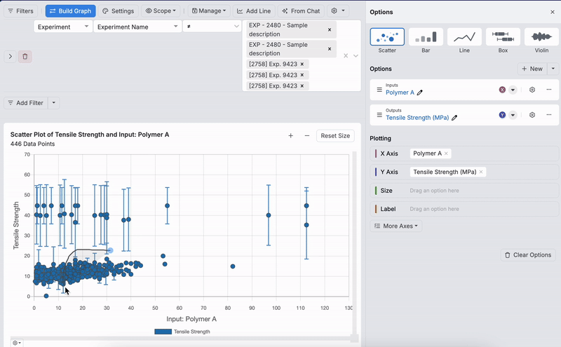
- Filters — Click Add Filter to narrow data (e.g., experiments containing an ingredient or meeting a threshold, experiment metadata, ingredients, lot information).
- To learn more about how to filter your visualization by lot information, refer to Filtering by Lot Information.
- Lasso — Draw a freeform boundary to include, exclude, or compare selected points—handy for removing outliers or focusing on a region.
Explore Data Settings
Click Settings to access key visualization controls, such as axes & scales, legends, labels/units, aggregation/binning, error bars, jitter/smoothing, sorting/stacking, and style options.
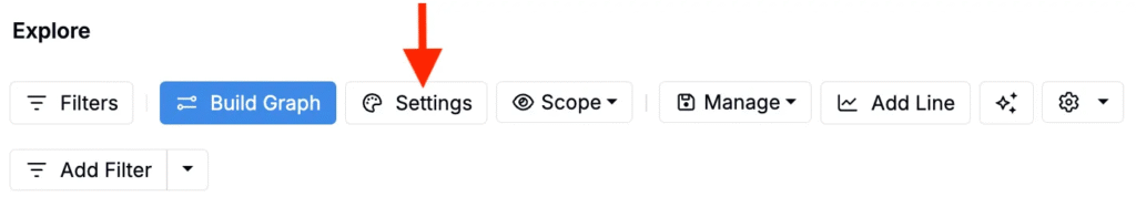
To learn more, see Explore Data Visualization Settings.
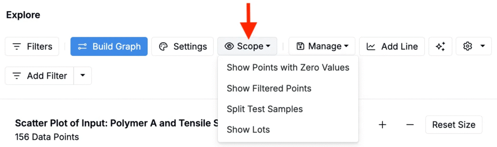
Scope
Scope options are available from the Scope button above the plot. These settings let you control what data is included in your chart:
- Show Points with Zero Values
- Show Filtered Points
- Split Test Samples — Separate from parent or group together.
- Show Lots — Include experiment lots.
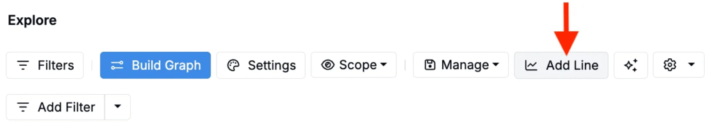
Adding a Line
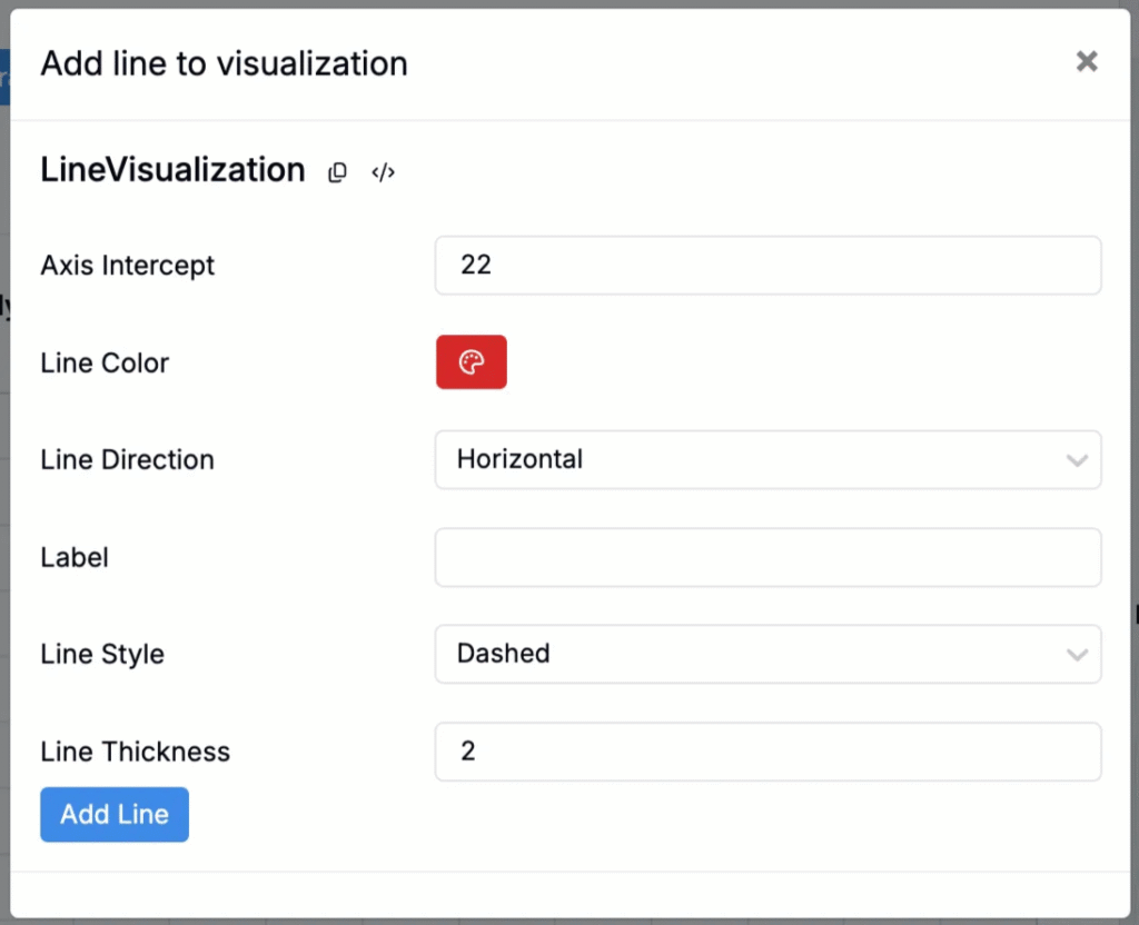
To highlight thresholds or reference points, click Add Line and configure:
- Axis Intercept — Where the line crosses the axis.
- Color — Line color.
- Direction — Horizontal or vertical.
- Label — Line text.
- Style — Dashed/dotted/solid.
- Thickness — Line width.
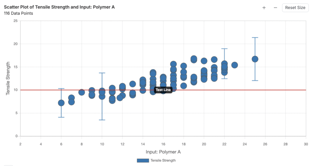
Spec Highlighting
If a project spec has been created, spec highlighting and labels will also automatically appear on any visualizations created within that project.
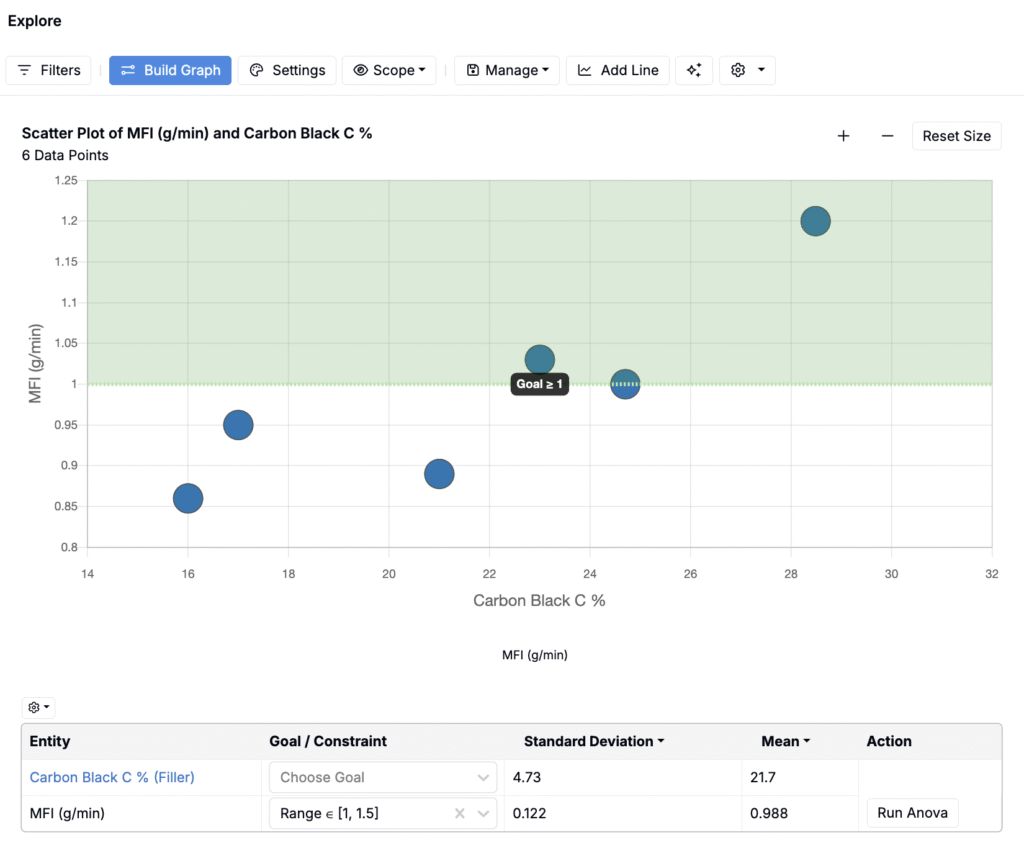
Spec highlighting and labels can be hidden within the Lines tab of the Settings modal.

Saving and Loading Visualizations
Use the Manage button to save and reuse plots:
- Save Visualization — Save to a notebook for reporting or as a template for future plots.
- Load Visualization — Open a saved plot.
- View Plot Templates — Jump to Plot Templates to apply saved templates across projects/material families.

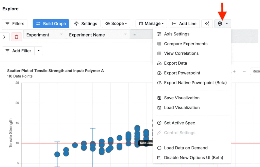
Additional Tools
The ⚙️ icon on the Explore Data page opens extra tools:
- View Correlations — Open the correlations page.
- Export Data — Download XLSX.
- Save/Load Visualizations — Quick access.
- Set Active Spec — Define/apply an active spec.
- Load Data on Demand — Switch to manual data loading (shows a Load Data button on the page).