Use View Curves to overlay and analyze curve‑type measurements across experiments. This article covers selecting curves, filtering, styling, labeling, adding reference lines, handling replicates, formatting axes and units, and saving or exporting your visualization.
Visualizing Curves
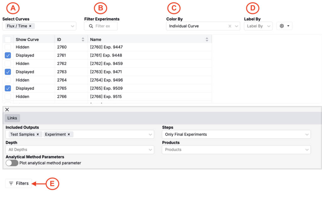
- To access the tool, select Visualize > View Curves from the navigation bar.
- To build a plot, select the curves (A) and experiments (B) you’d like to compare.
- (Optional) Color (C) and/or label (D) curves by data associated with your selected experiments (e.g. individual curve, experiment name, ingredients, process parameters, outputs, condition parameters, etc.).
- Apply filters (E) to focus the dataset (e.g. filtering out curves associated with experiments that fail to meet certain criteria).
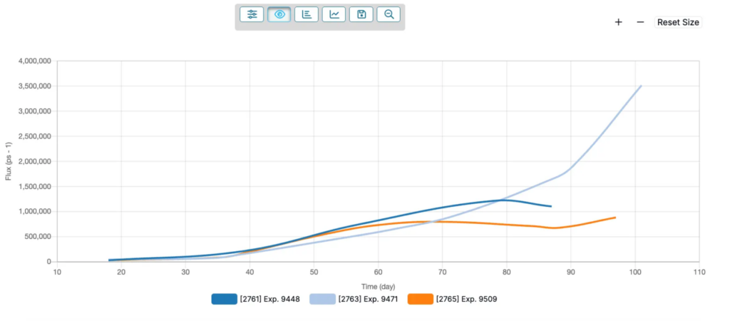
Once your plot has been created, use the + and – icons in the top right corner to zoom in and out. Click the 🔍 in the top toolbar to reset your zoom.
Customizing the Plot
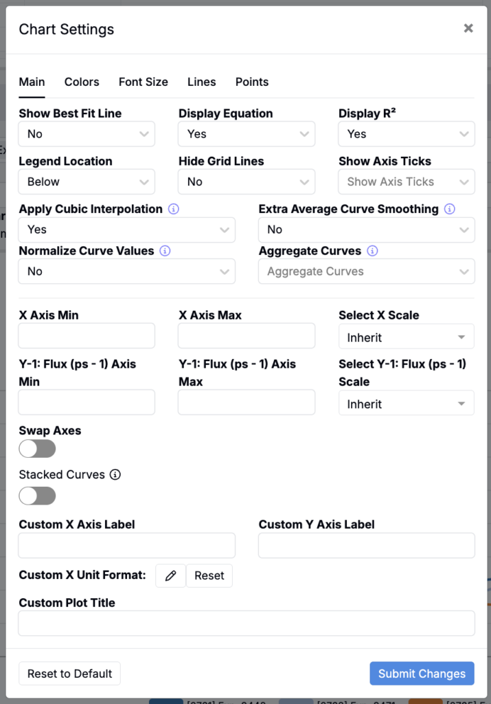
Chart Settings
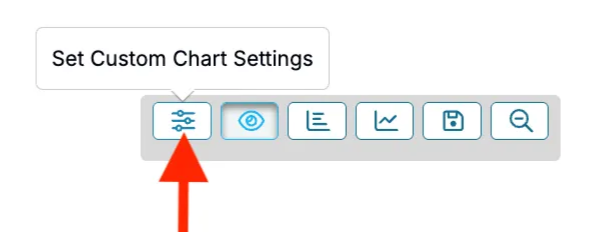
By selecting the Set Custom Chart Settings from the top toolbar, you can toggle and adjust additional settings.
- Best fit line — Fit a model to each series to summarize the trend. Useful for comparing general behavior across noisy data (None, Linear, Quadratic, Logarithmic, Exponential, Power).
- Display equation and R² — Show or hide the fitted equation and coefficient of determination on the chart to quantify goodness of fit.
- Legend — Control where the legend appears, or hide it to maximize plotting area (Above, Below, Left, Right, Hidden).
- Grid lines — Toggle background grid to make reading values and intersections easier.
- Axis ticks — Show or hide tick marks and labels.
- Cubic interpolation — Smooth lines using a cubic spline between points. Affects appearance only, not underlying data.
- Extra smoothing for averages — Apply additional smoothing to replicate‑averaged curves to reduce residual noise.
- Normalize values — Rescale y values so curves are comparable on the same scale.
- Aggregate curves — Combine multiple curves into a single representative curve. Use By Experiment to get one curve per experiment when multiple runs exist).
- X scale — Choose the x‑axis scale. Linear preserves distances; Log emphasizes ratios and early‑time dynamics (Inherit, Linear, Log).
- X axis range — Manually set x‑axis Min and Max. Leave blank for automatic bounds.
- Y‑1 axis range (Flux (ps⁻¹)) — Manually set y‑axis Min and Max for the primary axis. Leave blank for automatic bounds.
- Swap axes — Flip x and y to view the inverse relationship or align with publication conventions.
- Stacked curves — Offset series vertically by a y value so shapes are easier to compare without overlap.
- Custom axis labels — Override default x and y axis titles.
- Custom plot title — Set a descriptive title for exports and saved views.
- Color palette — Choose a palette to maximize contrast or accessibility.
- Font size — Adjust label and legend text size for readability.
- Variable line styles — Differentiate series using dash and dot patterns.
- Line thickness — Control line weight.
- Point size — Set point size.
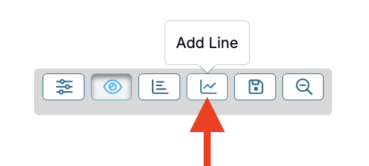
Add Lines
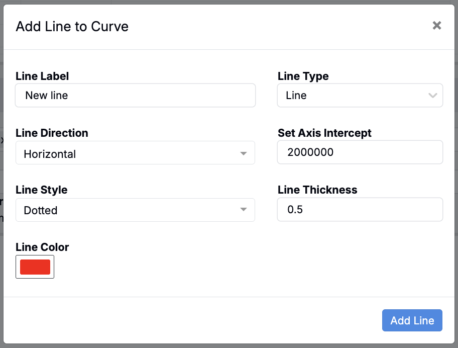
By selecting the Add Line option in the top toolbar, you can add a line to your plot.
Within the modal you can add a custom line label and specify the line type, direction, axis intercept, style, color, and thickness.
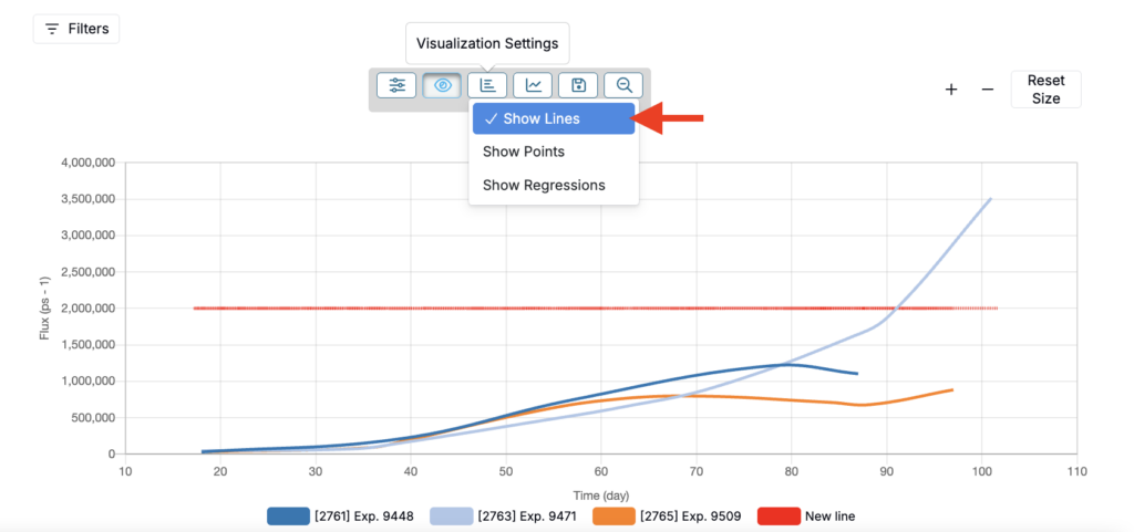
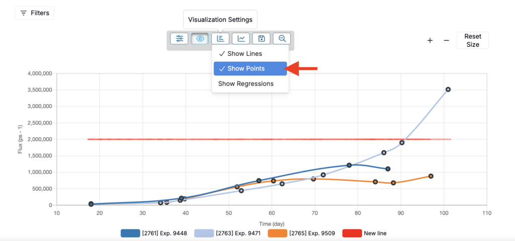
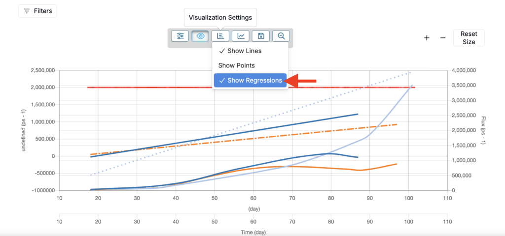
Visualization Settings
By selecting the Visualization Settings option in the top toolbar, you can set whether to show lines, points, and/or regressions in your plot.
- Show Lines
- Connects each series’ points with a line so you can follow the shape of the curve over time or x‑value.
- Appearance respects your Chart Settings such as Cubic interpolation, Variable line styles, Line thickness, Color palette, and Axis scale.
- Helpful when you want to emphasize overall trends or compare shapes across experiments.
- Show Points
- Draws markers at the raw observations used to build each curve.
- Size follows your Point size setting. Even when points are hidden, the data is still used for lines and regressions.
- Useful to inspect sampling density, gaps, and potential outliers without clutter from connecting lines.
- Show Regressions
- Overlays the fitted model for each series based on Best fit line in Chart Settings (Linear, Quadratic, Logarithmic, Exponential, Power, etc.).
- Can optionally display the fit equation and R² if you enable Display equation and R² in Chart Settings.
- Respects axis choices and scaling (e.g., Log x).
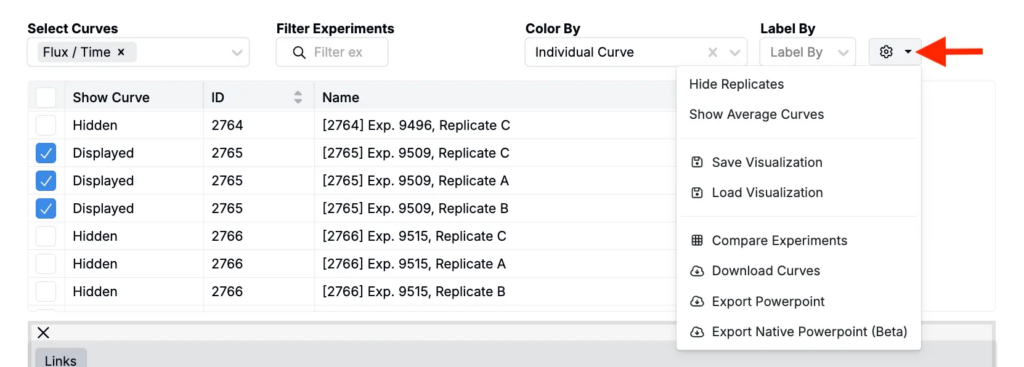
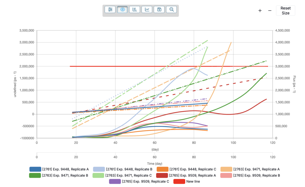
Expanding Replicates
Replicates are repeated runs of the same experiment or condition. To view replicates on the curve, click the ⚙️ in the top‑right and choose Expand Replicates / Show Full Data.
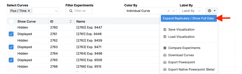
The plot will redraw with one curve per replicate for every selected experiment and curve type.
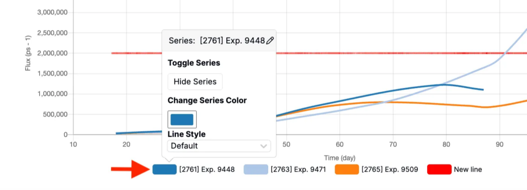
Editing individual series
To hide or change the color or style used for any individual series, you can click on the name from the plot legend. In the pop-up dialoge box, you will see options to hide, change series color, ad change line style.
Saving, loading, comparing, and exporting
To save, load, access a Compare view, or export curves, click the ⚙️ icon in the top right corner and select from the menu.