
After a model trains in Analyze with AI, it shows a plot of what the model predicted against what was actually measured. It’s one of the metrics to gain insight into model quality, and it can reveal error patterns that a single summary number hides. This guide covers how to read it.
How to read the plot
1. Every point is one experiment
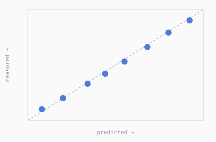
The horizontal axis is what the model predicted for that recipe. The vertical axis is what was measured in the lab and recorded in Uncountable. A dot on the dashed line means the model predicted the actual value that was measured. Points close to the line are smaller misses; points far from the line are larger misses.
2. How the predictions are made
Each point comes from leave-one-out (LOO) cross-validation. For every recipe, the model’s fit is recomputed with that one recipe excluded, and used to predict it as though it had never been part of training.
3. The dashed diagonal is predicted = measured
The dashed diagonal is “predicted = measured.” This is a tool to help judge the model accuracy by how tightly points collect near the line and where the data is sparse. How points stray from the line — sideways, into bands, into a fan — can point to different underlying issues, covered below.
How to diagnose the pattern you see
Find the picture below that looks like yours. Each pattern is associated with a plausible cause and a plausible fix — treat these as hypotheses to check, not diagnoses, since several can apply at once and other explanations are possible.
Vertical line (guessing the average)
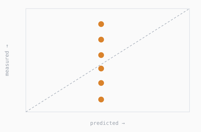
What you see: The model predicts almost the same number for every recipe, even though measurements span a wide range.
Possible cause: The GP model can’t see what’s driving the property, so it plays it safe and guesses the average every time. The model may lack access to whatever is actually driving the property — a missing ingredient, process condition, or unmodeled subgroup of recipes. Note this explanation applies to GP ML models.
What to do: Confirm the inputs that vary between recipes are included as predictors, check for blank values in recipe data where they shouldn’t be 0, and consider modeling distinct product families separately.
Points steeper than the line
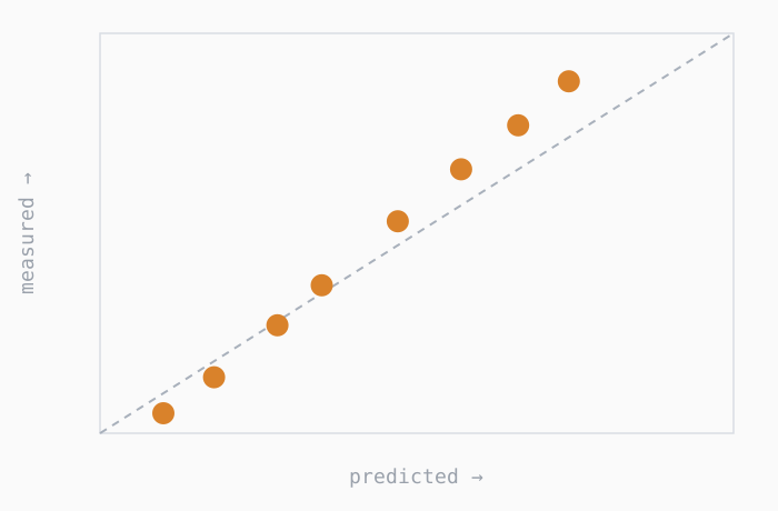
What you see: The points are steeper than the diagonal, leaning toward vertical: the highest measurements are under-predicted (above the line) and the lowest are over-predicted (below it). Predictions squeeze into a narrow range while measurements still spread wide.
Possible cause: A weaker version of the pattern above — the GP model has found some signal but is hedging toward the average because the signal is small relative to noise.
What to do: Give it stronger signal — more experiments, cleaner measurements, or the missing driver. More experiments or cleaner measurements can help if the effect is real but hard to see. If the input genuinely moves the property only slightly relative to run-to-run noise, no model can tighten this further — what matters is effect size relative to noise, not the effect alone.
Horizontal bands (measurement can’t resolve it)
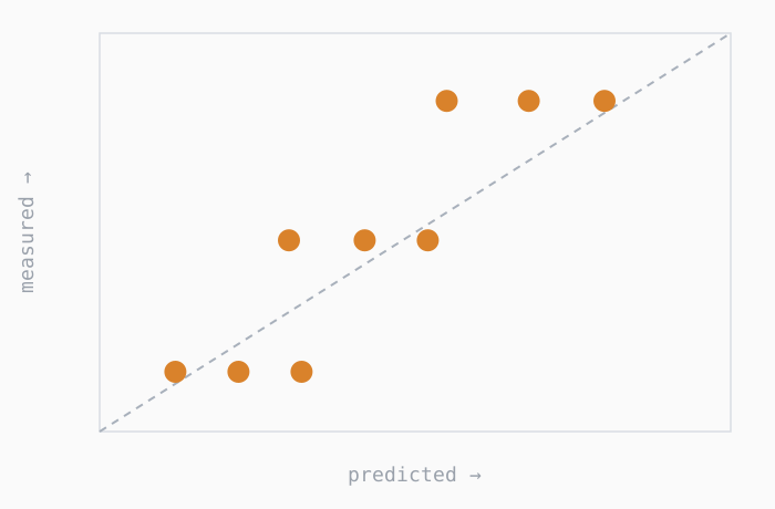
What you see: Measured values stack up on a few flat levels, while predictions spread out sideways within each level.
Possible cause: This is usually the measurement, not the model. The test only reports a few values — a pass/fail rating, a 1–5 score, a rounded readout, or a value that hits the instrument’s floor or ceiling (“< 5”, “> 1000”). The model sees real differences the test can’t record.
What to do: Use a test with finer resolution, or record the raw number instead of a rounded/capped one. If the property is truly a rating, tell the platform to treat it as a category rather than a continuous number.
Separate clusters (looks better than it is)
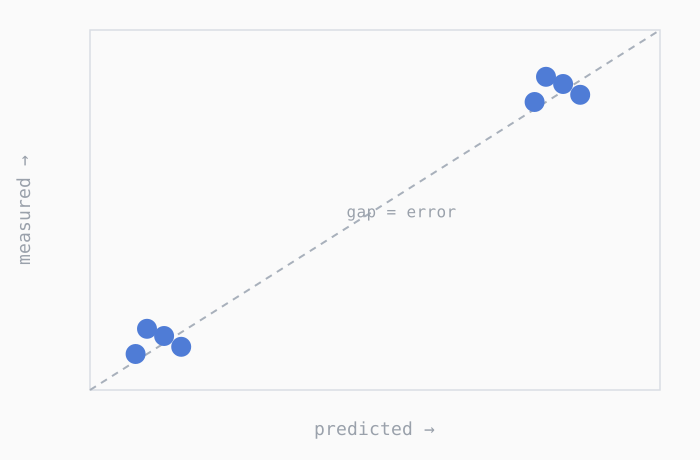
What you see: Two or more tight groups, sitting near the line, with a big empty gap between them. The other model metrics look good.
Possible cause: The model may only be distinguishing the groups (e.g., two base resins) without doing much useful ranking within either one — the gap between groups can inflate summary metrics like R².
What to do: Look at the fit inside a single group rather than across both. If the groups are genuinely different systems, model them separately.
Extremes pulled to the middle
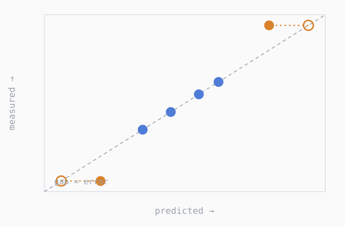
What you see: The middle of the range sits on the line, but the highest- and lowest-measuring recipes are pulled toward the center.
Possible cause: Extreme recipes usually have fewer near-neighbors to learn from, so the GP model stays cautious there — a known limitation, but a meaningful one since extremes are often what optimization targets.
*Note that other model types may have different explanations.
What to do: Run a few more experiments near the highest- and lowest-measuring recipes so the edges are no longer sparse and the model can learn more in those areas.
Funnel / fan shape (wrong scale)
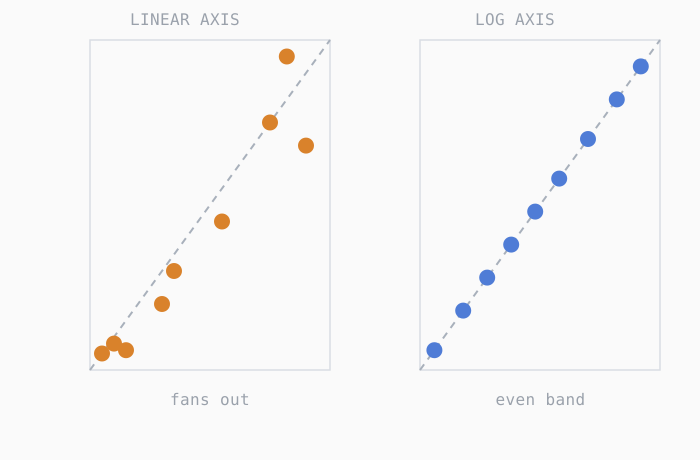
What you see: On a linear axis, points hug the line at low values but fan out as values grow, with low values crowded into a corner.
Possible cause: Proportional rather than fixed error — common for properties spanning orders of magnitude (eg viscosity).
What to do: Modeling the output on a log scale and retraining; this changes what the model treats as “error” and typically evens out the band. Switching just the display axis to log makes the plot easier to read, but doesn’t itself change the model — retraining on the log-transformed output is what would improve it.
Two parallel bands (hidden group in the data)
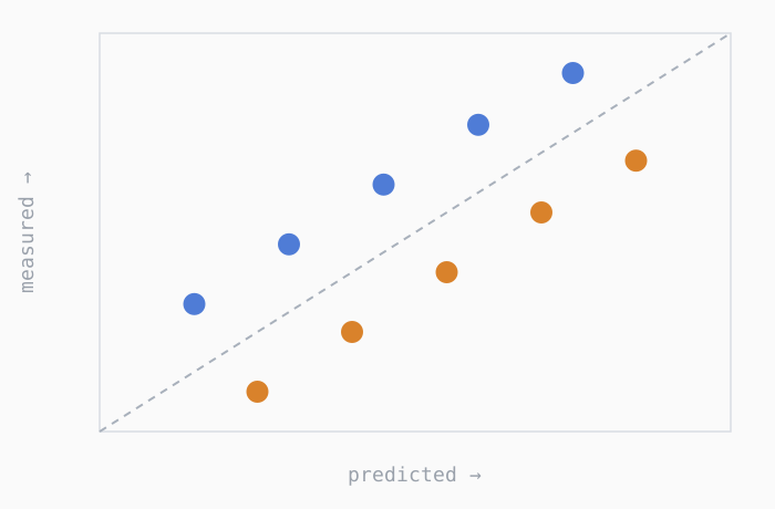
What you see: Two groups of points parallel to the diagonal, one riding above the line and one below, often at the similar predicted values.
Possible cause: An unmodeled grouping variable (lab, instrument, lot, operator) with a different baseline in each group — the model splits the difference and lands off in both directions. (A shift shared by every point wouldn’t produce this pattern; it only shows up when groups disagree.)
What to do: Add information identifying the group (lab, instrument, lot, method, etc.) as a predictor to the model and retrain, so the model can hold a separate baseline for each. If one group reflects a known calibration issue, correct or exclude it.
Possible outliers
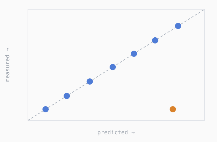
What you see: Most points hug the line except one (or a handful) sitting far off on their own.
What it likely means: A data error (typo or mislabeled run) or a genuinely unusual recipe with no similar neighbors to learn from.
What to do: Investigate that experiment first. If it’s an error, fix or remove it; if it’s real but isolated, additional similar recipes would help — and note that removing it narrows the range the model can be trusted in.
Conclusion
This is a quick reference for interpreting the predicted-vs-measured plot in Analyze with AI and using it to guide model quality understanding.